Check Icons 3D Icons
113 ticks, checklists and approval badges — the icons a product shows when something went right.














Explore More Categories
The check mark is the only icon most users are genuinely pleased to see. It confirms a payment, closes a task, passes a validation. Having a full family of them — plain, badged, on a storefront, with a leaf, held in a hand — means the confirmation matches the moment instead of repeating one generic tick everywhere.
Design Examples
See how these icons look in real website designs


What is in the set
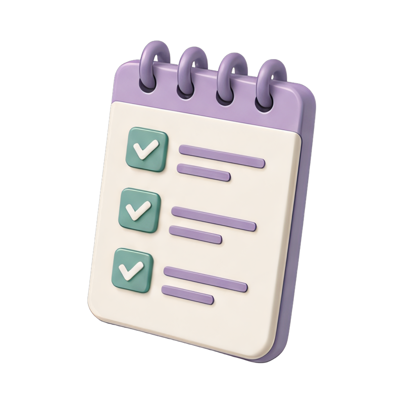
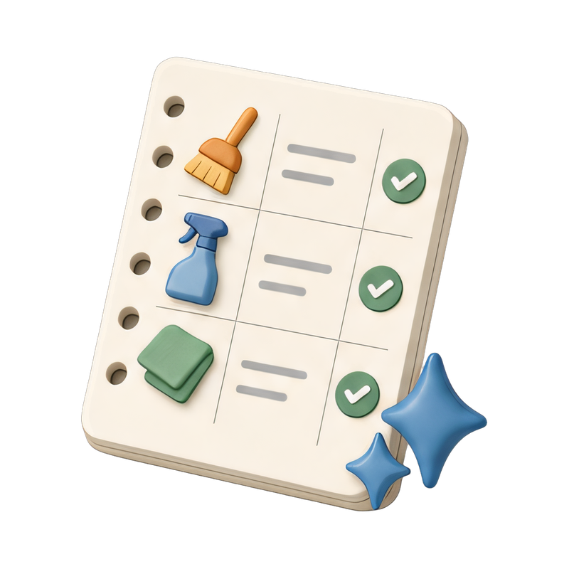
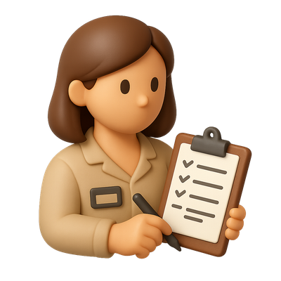
Plain ticks in green and other colours, on circles and plain backgrounds. Badged and sealed checks for verification and approval. Checklists with pencils, hands and clipboards for task states. Contextual combinations — storefront verified, eco-friendly check, validator marks. Plus feedback and ballot motifs for forms and voting.
Where these work best
Order confirmations and success screens, form validation, onboarding checklists, verification badges, and pricing tables comparing what each plan includes. Arrow and star handle the other small interface glyphs.
Frequently asked questions
- Is there a plain green tick?
- Yes, in more than one treatment — plain, on a circle and as a badge — so you can match the weight of the moment.
- Are checklists included?
- Yes, with pencils, hands and clipboards, which suits onboarding and task interfaces.
- Can I use them in a paid product?
- Yes. Free downloads ask for a credit to Woopicx; subscribers skip that.